
Case study · Brand identity · Website · Design system
Her Nutrition: a calm, Hyderabad-first nutrition brand
Rebuilt end to end, from logo to a build-ready website: a new identity, a design system and 17 responsive templates, every page written for Hyderabad search.
Overview
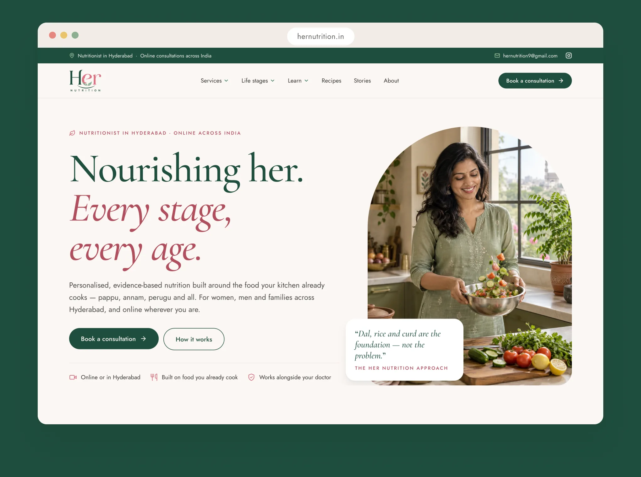
A nutrition practice that deserved to look as considered as its advice.
Her Nutrition is a Hyderabad nutrition practice founded by Mrs. Mudavath Shirisha. Its promise is simple — personalised, evidence-based guidance built around the food your kitchen already cooks: pappu, annam, perugu and all.
The existing site had the right values but none of the presence: placeholder images, a generic typeface and no clear path from reading to booking.
We rebuilt the brand system, rewrote every page for Hyderabad search, and designed 17 responsive templates ready to ship on Astro and Sanity — documented so a developer can build it without guessing.
- Client
- Her Nutrition — Hyderabad, Telangana
- Studio
- Digital Architect
- Our role
- Brand system · UX/UI · Content & SEO · Dev handoff
- Breakpoints
- Desktop 1440 · Tablet 834 · Mobile 390
- Status
- Design complete · 2026
- page templates
- 17
- responsive frames
- 57
- components
- 21
- custom icons
- 36
- design tokens
- 81
The challenge
Good advice, hidden behind a site that didn’t earn trust.
Before touching pixels we audited every page of the existing site, mapped the content, and listed what was stopping a visitor from becoming a client. Six problems kept coming up.
Placeholder imagery
Stock and AI placeholder photos made a deeply personal practice feel anonymous.
No brand system
A generic typeface, ad-hoc colours and no logo rules — nothing the team could reuse for posters or Instagram.
No path to booking
Calls to action were scattered, and nothing explained what a consultation involves or how it works.
Thin local signals
Titles and copy didn’t speak to Hyderabad searches, so the site competed nationally — and lost.
Advice without structure
Conditions, life stages and recipes sat side by side, making ‘PCOS’ or ‘pregnancy’ hard to find.
Mobile as an afterthought
Discovery for a practice like this starts on Instagram, on a phone — the layout didn’t.
So the brief became four goals
- A
- Look as trustworthy as the advice is.
- B
- Make booking the obvious next step on every page.
- C
- Be found for ‘nutritionist in Hyderabad’ and its long tail.
- D
- Leave a system the team can reuse without a designer.
Process
Six phases, one file — from audit to a build-ready handoff.
Discover
Audit & listening
An inventory of every page, a scan of how Hyderabad nutritionists present themselves, and research into what local women actually search for.
Site audit · Content map · Search-intent research
Define
Strategy & information architecture
We organised the site around the two ways people look for help — by condition and by life stage — and made booking the spine of every journey.
Sitemap · 17 templates · User journeys · Page briefs
Brand
Identity system
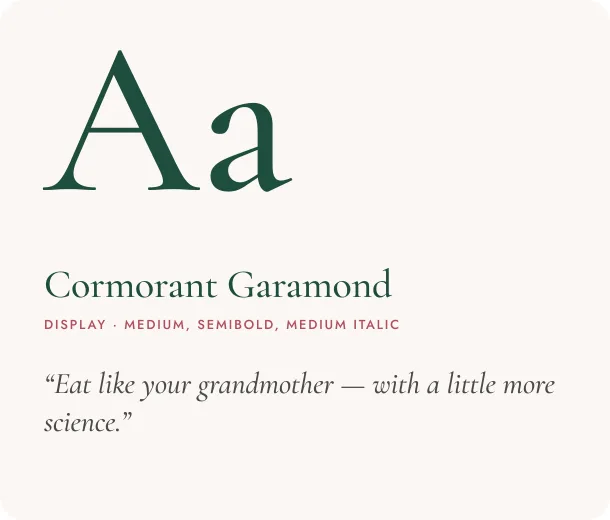
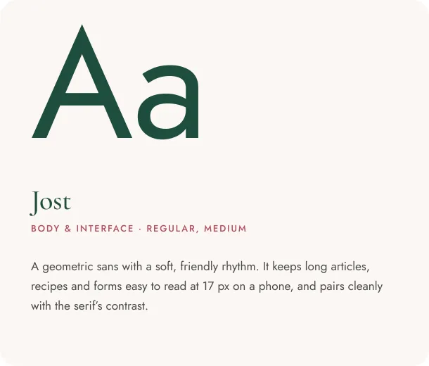
A refined monogram, a warm botanical palette, a Cormorant Garamond + Jost pairing, leaf motifs, photography direction and a voice that sounds like a person.
Logo suite · Colour & type · Brand guidelines
System
Design system in Figma
Variables for colour, spacing and radius; a full text-style scale; components built with variants and properties so pages are assembled, not drawn.
81 tokens · 21 components · 36 icons
Design
Every page × three breakpoints
Seventeen templates designed at 1440, 834 and 390, with the copy rewritten in place — no lorem ipsum, ever.
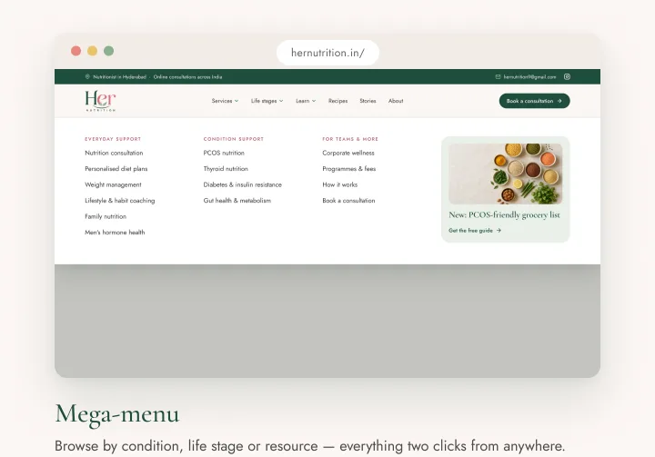
57 frames · Mega-menu · Booking flow · Empty & error states
Deliver
Content, SEO & handoff
Route map, Sanity schemas, JSON-LD per template, performance budgets, and on-brand social templates for the team.
Dev handoff · Hyderabad SEO map · Social & print templates
Identity
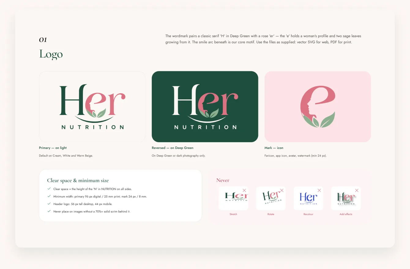
A wordmark with a sprout at its heart.
The ‘e’ of Her doubles as a seed, putting out two sage leaves; the arc beneath is a quiet smile. Classical letterforms say expertise, the botanical detail says food — and together they read as warm, not clinical.
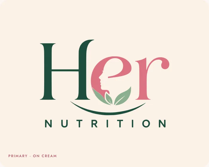
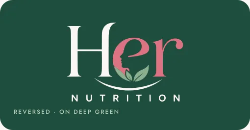
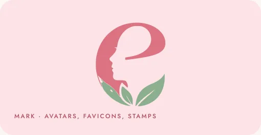
From the brand guidelines
Clear space, minimum sizes, colour versions and misuse — documented once, so every poster and post gets it right.
Colour & type
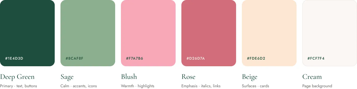
A palette from the kitchen garden; type with a little poetry.
Deep Green for text and buttons, Sage for calm accents, Blush and Rose for warmth and emphasis, Beige and Cream for surfaces. Cream and beige carry 55% of every page, green 25%, sage 12% and rose 8%.
Art direction
Leaves, daylight and real kitchens.
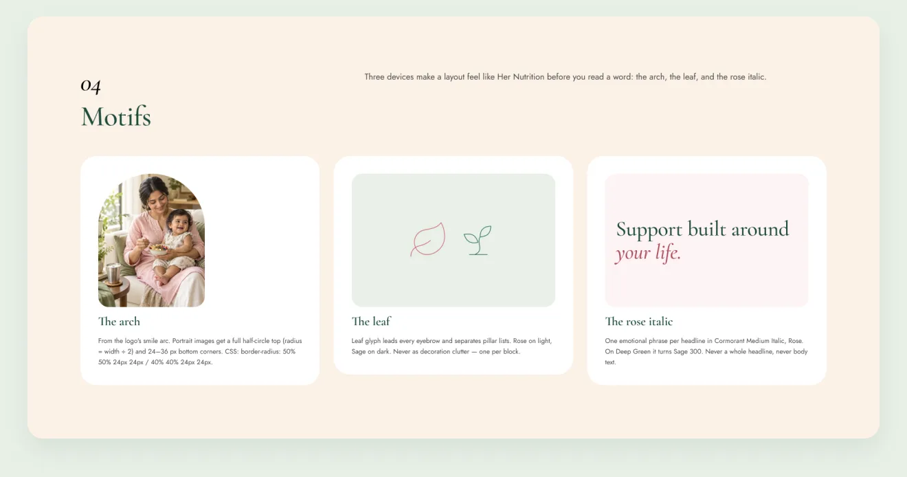
- Motifs
- Hand-drawn leaves and the smile arc from the logo, used sparingly — as frames, dividers and soft watermarks.
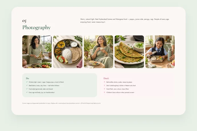
- Photography
- Warm daylight, real hands and Telugu home food on steel and terracotta. Abundant plates, never diet-culture salads.
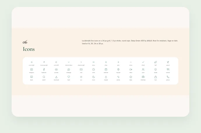
- Icons
- 36 custom line icons drawn on one grid with rounded strokes, so they sit naturally beside the serif.
Design system
Built once in Figma, so every page is assembled — not drawn.
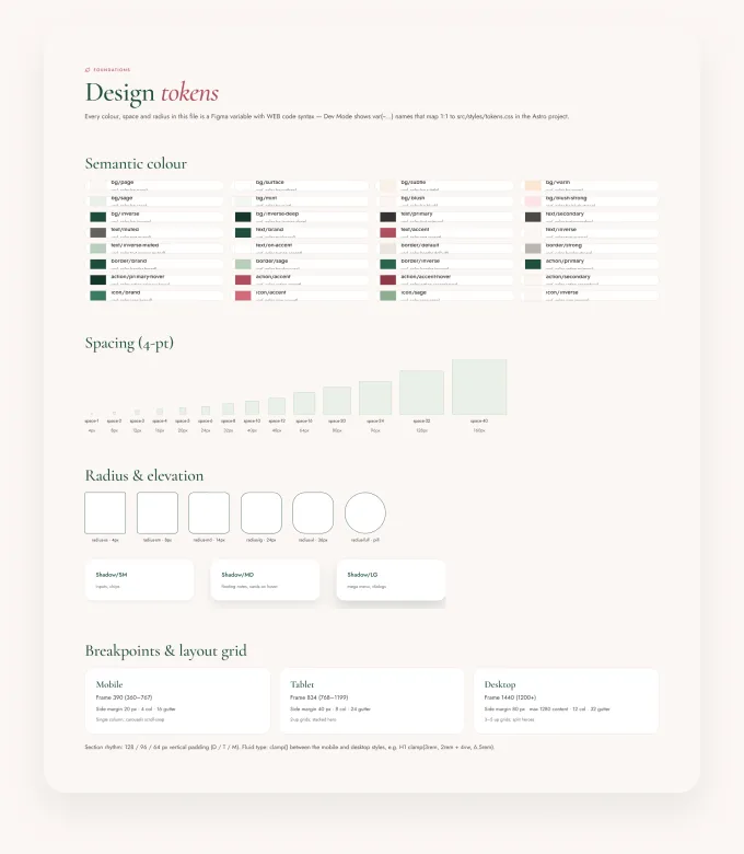
Variables, never hex. Every fill, gap and corner is bound to a variable that maps 1:1 to tokens.css — so a colour tweak in Figma is a one-line change in code.
- variables — colour, space, radius
- 81
- text styles
- 20
- components with variants
- 21
- icons
- 36
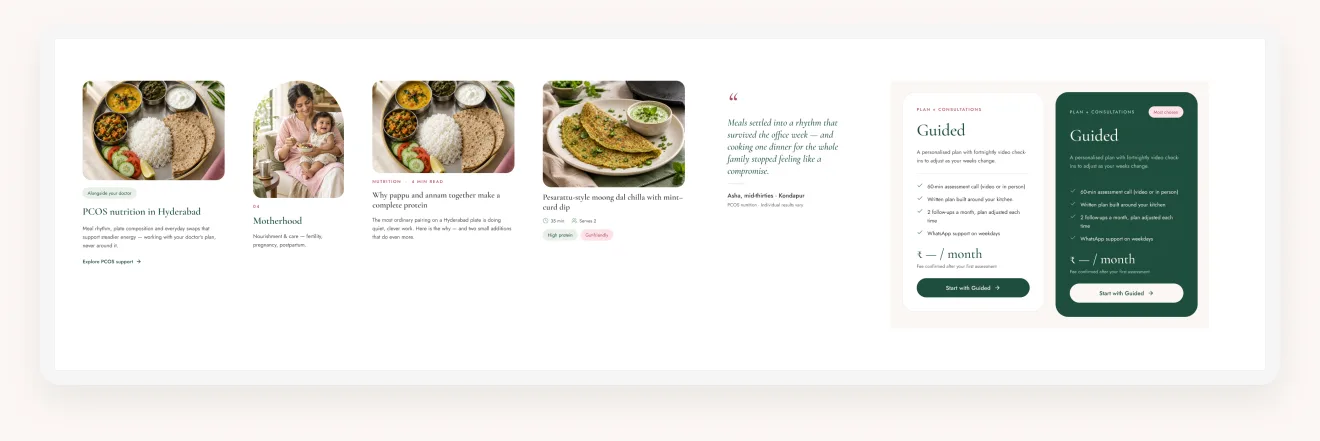
- Cards
- Service, stage, article, recipe, story and package — each fed straight from a Sanity document.
- Actions
- One button with style, size and icon properties covers every call to action on the site.
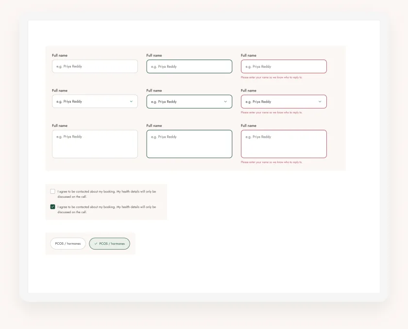
- Forms
- Fields, checkboxes and choice chips with labels that never disappear and errors that explain.
Homepage
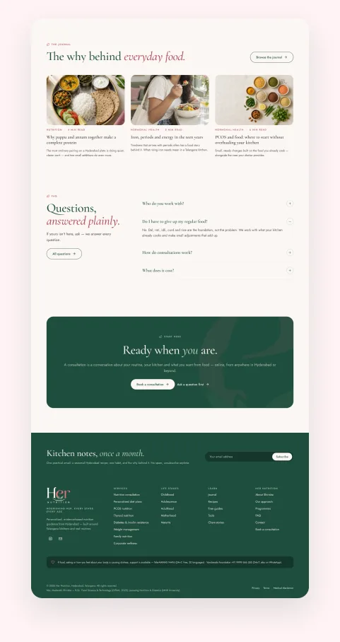
One scroll that answers: who is she, can she help me, how do I start?
The full desktop homepage, top to bottom. Each third has a job — orient, build trust, convert — and every section ends one step closer to booking.
01 · Orient
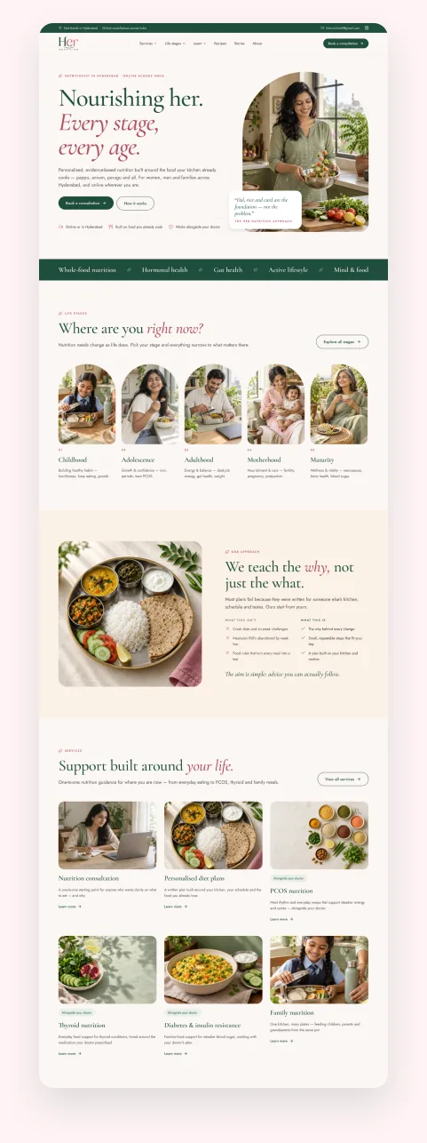
- 1
Hero H1 built around ‘nutritionist in Hyderabad’, with two clear calls to action.
- 2
Pillar strip Four promises, readable in a glance.
- 3
Life stages Six ways in — childhood to maturity.
- 4
Approach Food-first, evidence-led, rooted in the Telugu kitchen.
- 5
Services Conditions and everyday goals, each with its own page.
02 · Build trust
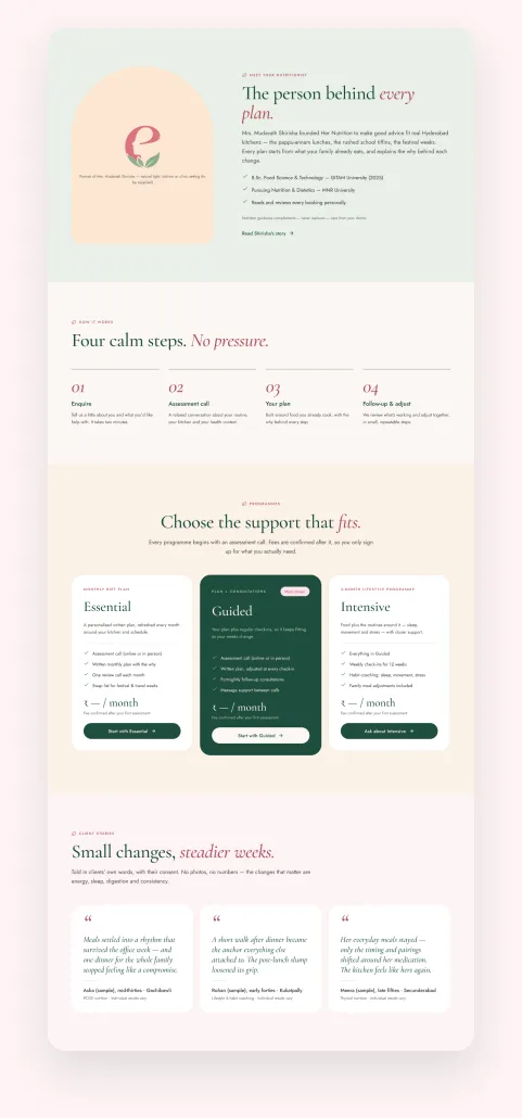
- 6
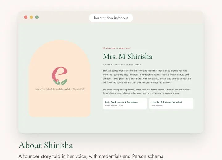
Meet Shirisha The founder’s story, credentials and why she started.
- 7
How it works A plain path from first call to follow-ups.
- 8
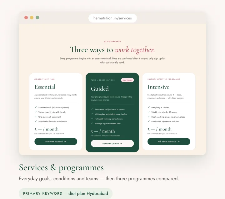
Programmes Three tiers, compared side by side.
- 9
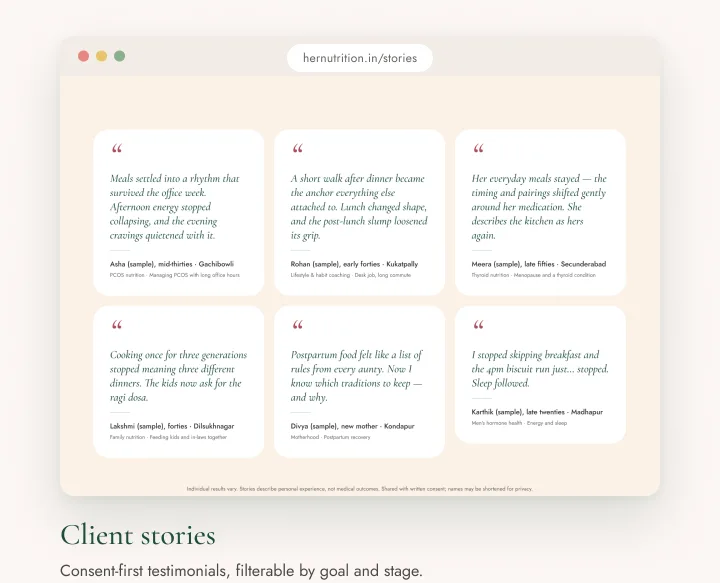
Client stories Consent-first testimonials (samples for now).
03 · Convert
- 10
Journal Articles and recipes that earn search traffic.
- 11
FAQ Real questions — and FAQPage schema for Google.
- 12
CTA band One last, unmissable invitation to book.
- 13
Footer Helplines, newsletter and legal, kept calm.
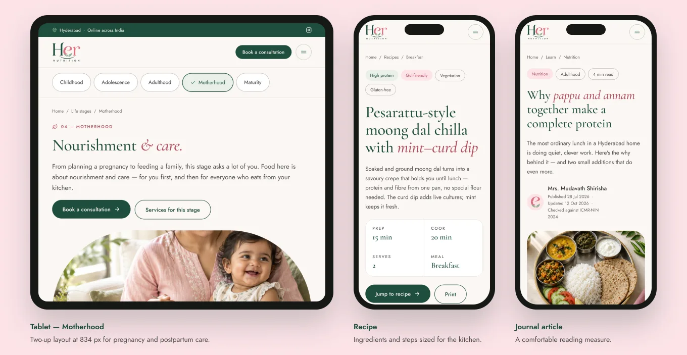
Responsive
Designed three times, not shrunk once.
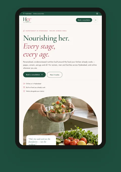
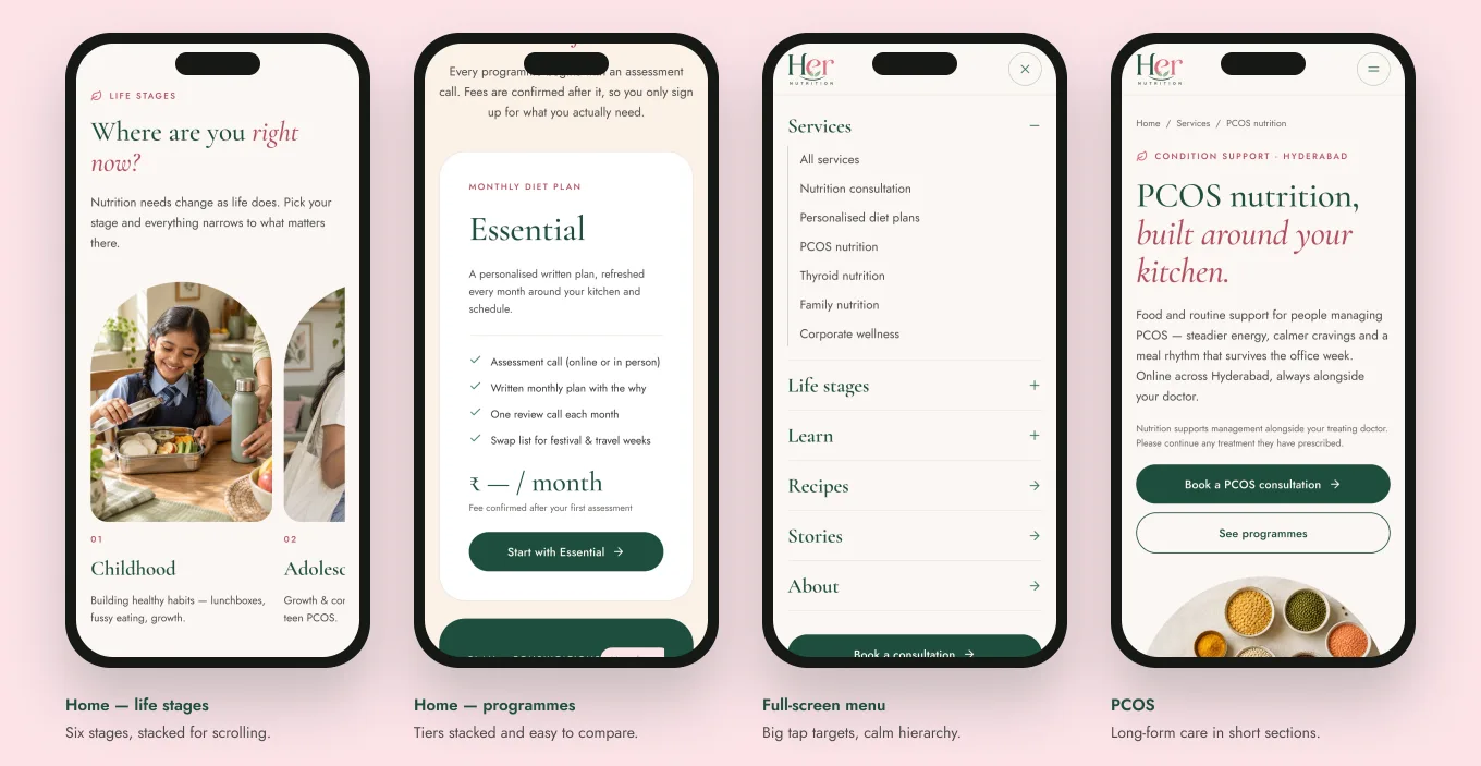
For a practice found through Instagram and WhatsApp, the phone is the real homepage. Every template has its own 390 px layout — not a squeezed desktop.
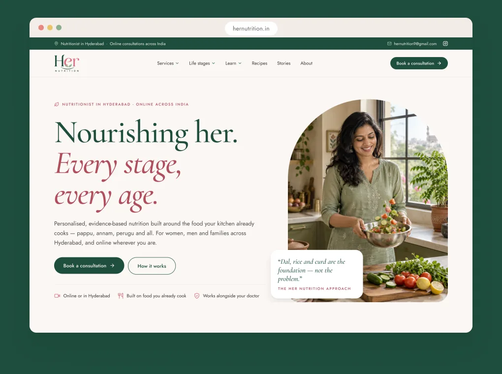
- Desktop · 1440 px
- Mega-menu navigation and editorial layouts with room for photography to breathe.
- Tablet · 834 px
- Two-up cards and a condensed header — tuned for the iPad on the kitchen counter.
- Mobile · 390 px
- Single column, a full-screen menu and 44 px tap targets for one-handed use.
Key pages
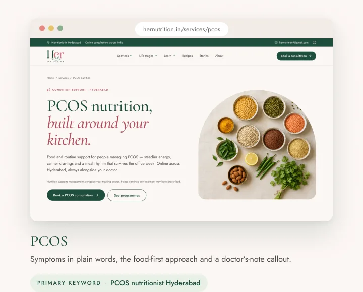
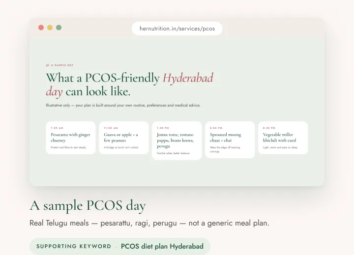
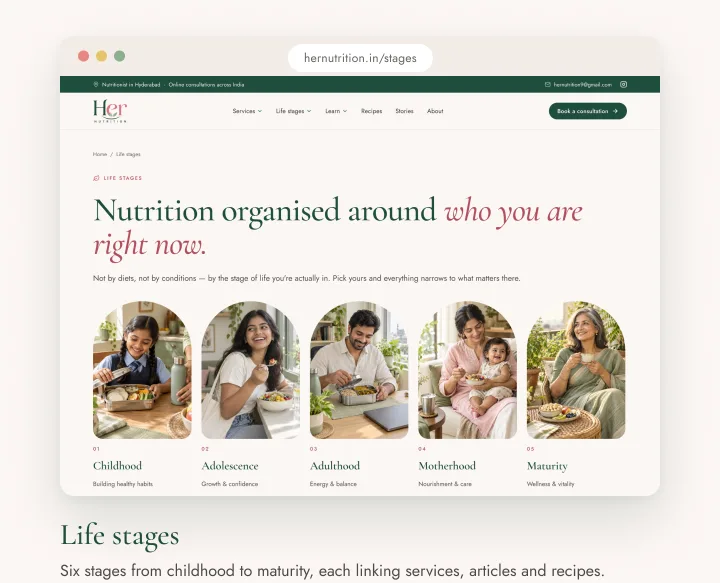
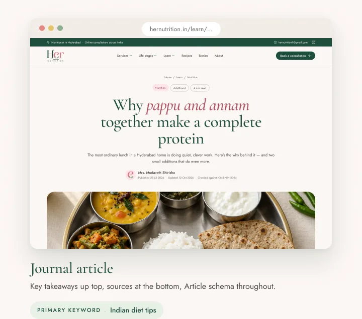
Seventeen templates, each written for a real search.
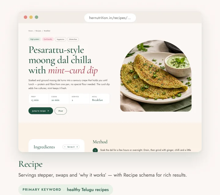
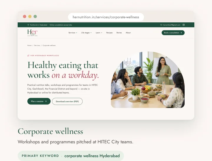
Every inner page has one primary keyword, supporting terms in its headings, alt text and FAQs — and a clear route to booking. A few of the templates:
Booking flow
From ‘maybe’ to booked — gently, in three steps.
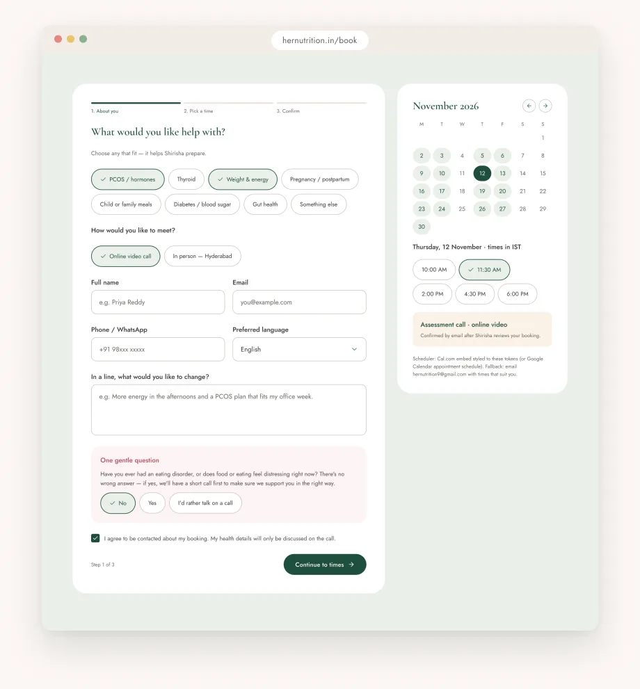
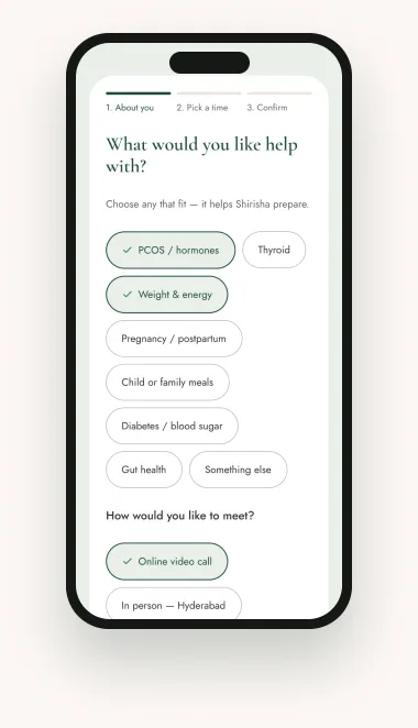
Three steps, always visible
About you → Pick a time → Confirm, with progress shown on every screen. Shirisha reviews each booking personally before confirming.
No health data in the form
History, medicines and reports are discussed on the call — never collected or stored by the website.
A gentle care question
An optional, kindly worded check about eating-related distress, with ‘I’d rather talk on a call’ as an equal choice.
SEO & build
Written for Hyderabad. Built to be fast.
Hyderabad keyword map
One primary keyword per page. Supporting terms live in H2s, alt text and FAQs.
| Page | Primary keyword |
|---|---|
| Home | nutritionist in Hyderabad |
| Services | diet plan Hyderabad |
| PCOS | PCOS nutritionist Hyderabad |
| Thyroid | thyroid diet Hyderabad |
| Diabetes | diabetes diet plan Hyderabad |
| Motherhood | pregnancy diet Hyderabad |
| Childhood | child nutritionist Hyderabad |
| Maturity | menopause nutrition Hyderabad |
| Corporate | corporate wellness Hyderabad |
| Recipes | healthy Telugu recipes |
How it’s built
Static-first, so pages load instantly and cost almost nothing to host.
- Design to code
- Figma variables (81 tokens) become a tokens file, and every Astro component matches its Figma component one to one.
- Content
- Shirisha edits in Sanity Studio; pages are built from it and published as static pages.
- Booking and search
- The booking form sends a confirmation by email and offers real calendar slots; site search runs on a static index.
Budgets set in the handoff
- LCP < 2.0 s on 4G
- CLS < 0.05
- INP < 150 ms
- WCAG 2.2 AA
- Zero JS by default
- JSON-LD on every template
Beyond the website
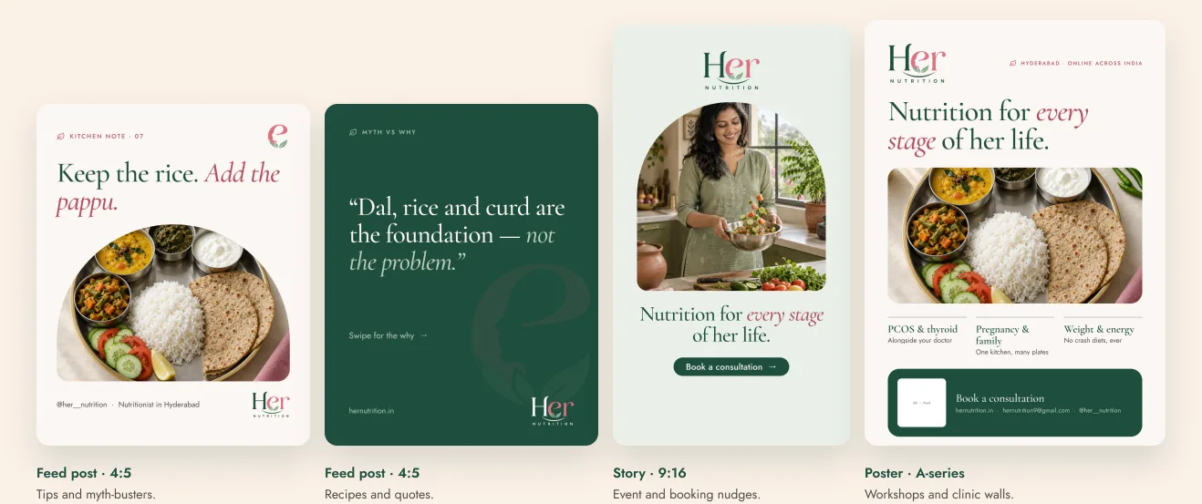
One system, ready for Instagram and print.
The guidelines ship with editable templates, so the team can publish on-brand posts, stories and clinic posters without opening a design tool from scratch.
Handover
Everything needed to launch — and to keep it looking this good.
- Brand guidelines
- Logo suite, colour, type, motifs, photography, icons and voice.
- Figma design system
- 81 variables, 20 text styles, 21 components and 36 icons.
- 17 page templates
- Every page at 1440, 834 and 390 — 57 frames in all.
- Hyderabad SEO map
- A primary keyword per page, plus JSON-LD for every template.
- Developer handoff
- Astro routes, Sanity schemas and a 1:1 component map.
- Social & print kit
- Feed posts, stories and posters on the same system.
What happens next
Confirm the details, then build and launch.
- Programme names, inclusions and fees
- Professional portrait and real photography to replace the AI concept images
- Real client stories, shared with written consent
- Legal review of the disclaimer, privacy policy (DPDP Act 2023) and terms
- Client
- Her Nutrition · Hyderabad
- Design & strategy
- Digital Architect
- Scope
- Brand · UX/UI · Content & SEO · Handoff
Concept imagery is AI-generated and client stories are placeholders pending consent. No performance results are claimed.
Services used
What this project used
Next case study
Build-Hive
A UK construction SaaS, and a website built to be found.
Free 30-minute strategy call
Want work like this for your business?
Tell us what you are building. You get a written plan and a fixed price before anything starts.